For a school project in 2022, I created a personal branding identity that reflects my personality and unique selling points. As I developed the concept, I received feedback suggesting that variety, imagination, and compassion are my most prominent characteristics. Therefore, I chose to incorporate these traits into my art direction.
Logo Development
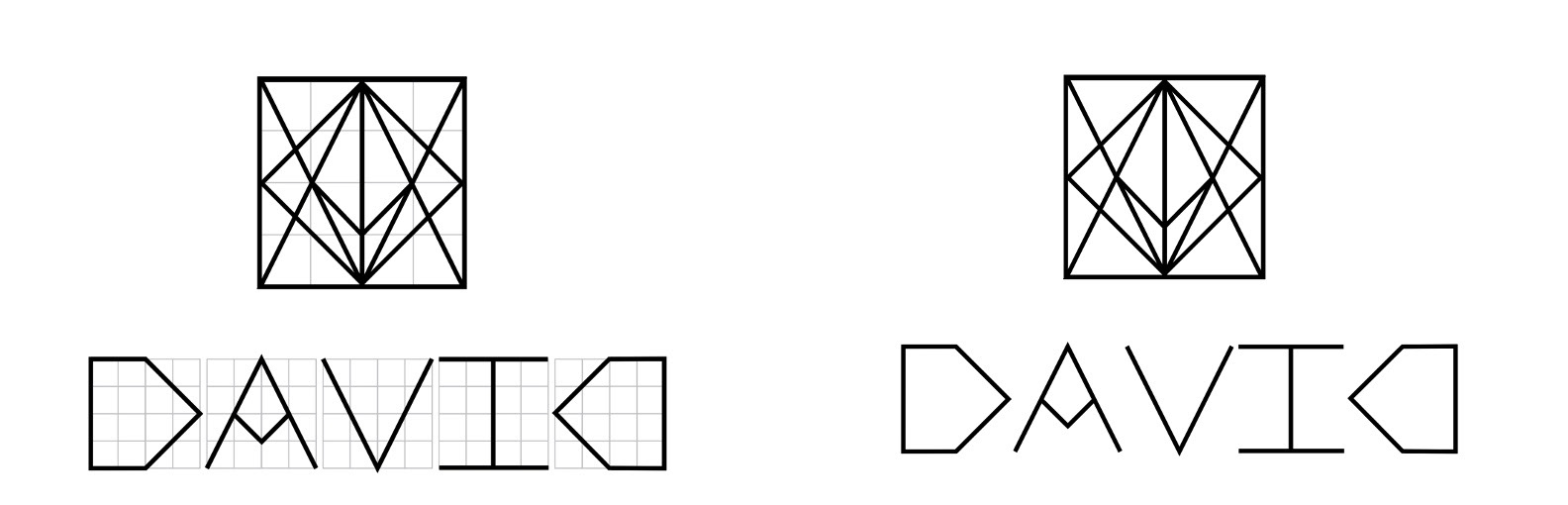
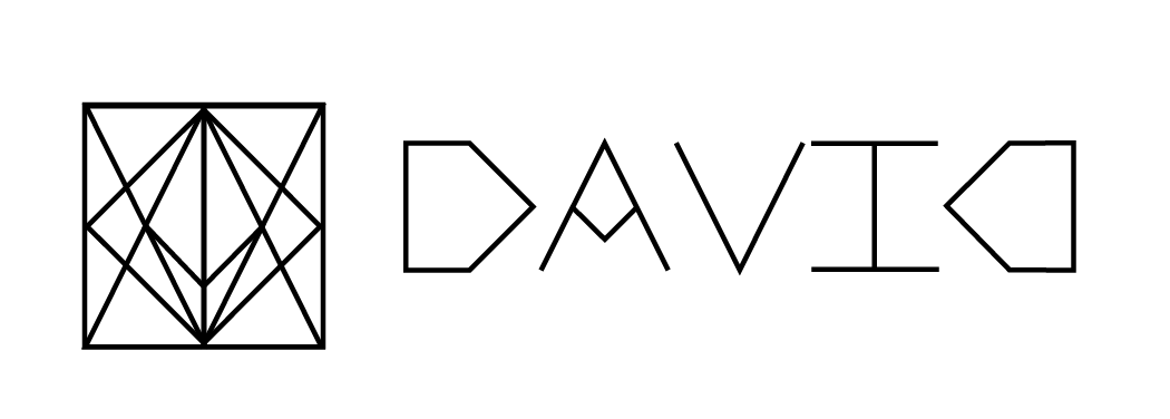
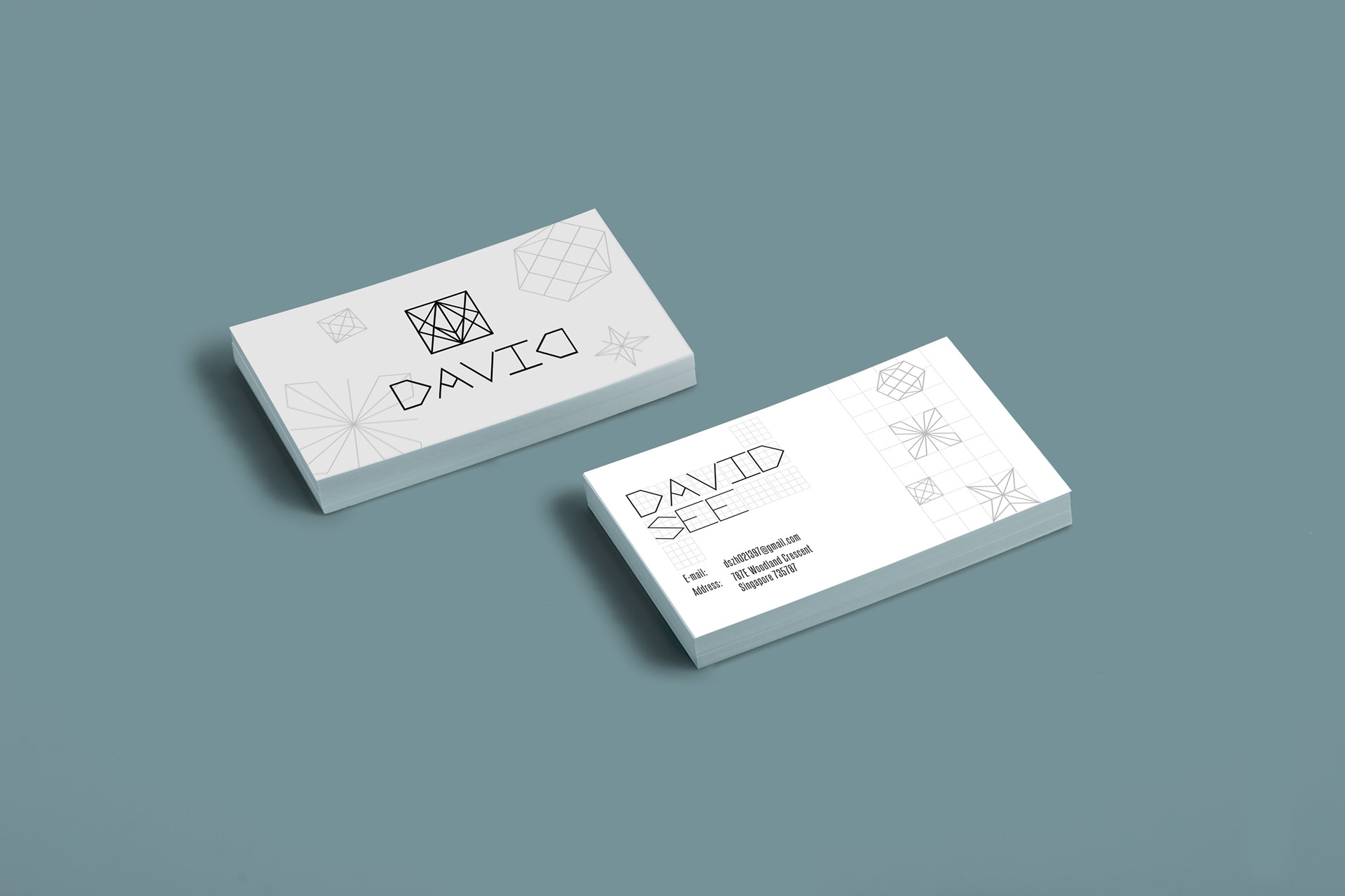
For the logo development, I utilized fixed boxes as the foundation and incorporated simple zig-zag lines to create a minimalist style surrounding the boxes, forming a series of typography. This typography serves as a supporting element. I consolidated all the letters of my name, "DAVID," into one box. It's noteworthy that I intentionally crafted the last "D" to provide stability to the logo.
The concept of using a grid of boxes as the basis for the design reflects aspects of my background. As a tax accountant, I often adhere to standards, laws, and regulations on a daily basis, which can be considered "fixed" without much room for stylistic flair. However, despite this, I also possess a creative side, allowing me to think outside the box and create visually engaging designs.
The design style maintains simplicity and modernity. Initially, the goal was to create a 2D visual within the grid of boxes. However, I aimed for the logo to achieve a sense of balance, incorporating elements of both 2D and 3D design principles. For instance, the reflection of the "D" stabilizes the logo, introducing a mix of 2D and 3D aesthetics through lines and polygons.
Typography and support graphics
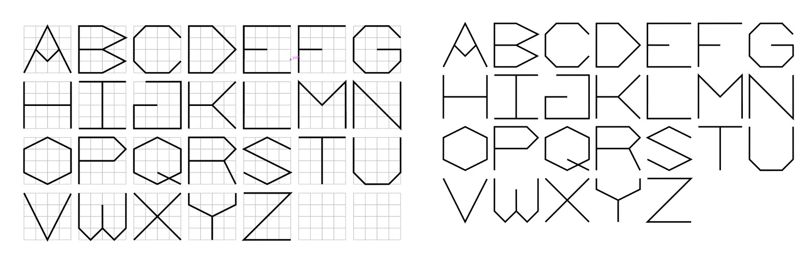
For the supporting graphics, I've developed a series of typography that complements the logo, maintaining consistency in style. These typographic elements are designed to be thinner compared to the logo, ensuring a clear visual hierarchy.
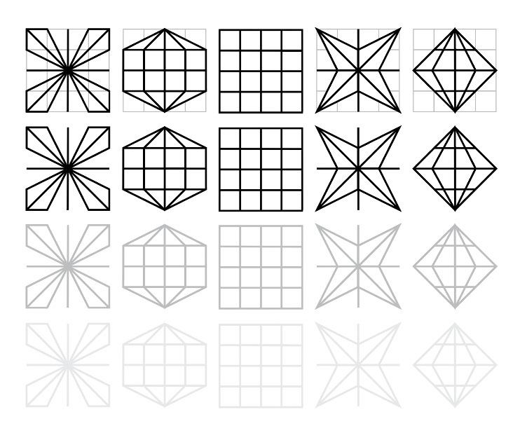
I have also created supporting graphic elements to convey the blend of 2D and 3D aesthetics. These elements are derived from the fixed box grid, featuring thinner lines and a light gray color to maintain consistency with the design concept. The grid serves as the foundational element in these graphics, emphasizing my flexibility and creativity in transforming a rigid, standardized background (accounting/financial) into dynamic 2D and 3D polygons from what could be considered mundane boxes.
Brand Identity Package
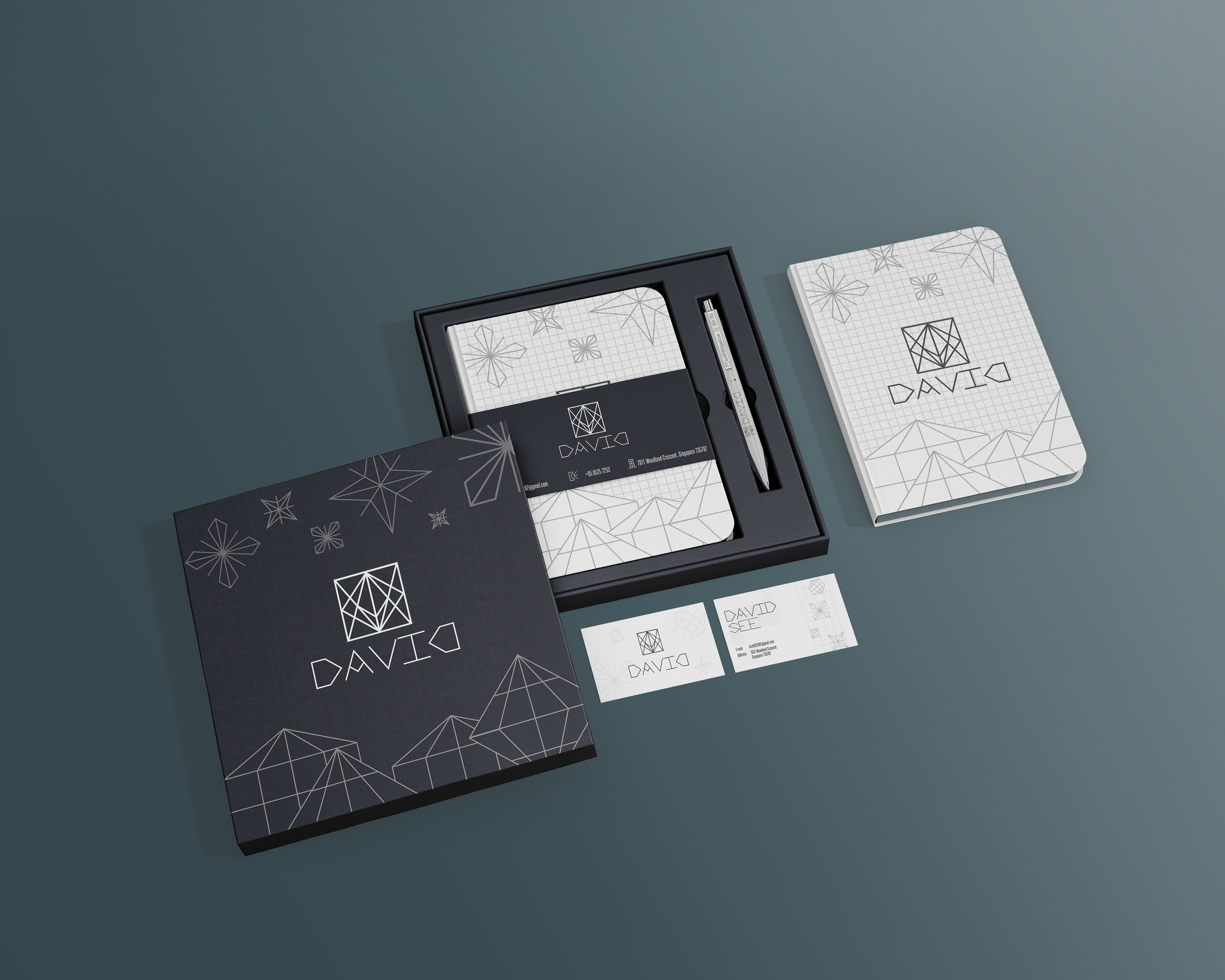
To ensure that people remember me as a designer after receiving my resume, I included a customized pen among my deliverables. This pen is both functional and convenient to carry in various meetings. It features my contact information, making it easy for potential clients or employers to recall me when they have design projects or tasks. Similarly, I also included a notebook as a deliverable, as it is useful during meetings and can further reinforce my branding.
Additionally, I included a branded case to store the notebook, pen, and business cards, ensuring they are easily kept together. This choice aligns with my brand concept and art direction, emphasizing practicality and professionalism.